Nora Turato
let’s never be like that
LambdaLambdaLambda
21.5. – 27.6.2020
Enamel is email is e-mail
Trapped between the desire for authenticity and the burden of uniformity, gentrified language has not only pervaded our urban fabrics, but also our (digital) bodies and brains. Our expressions balance on the fault lines of the too-early and already-too-late, the heart-felt and the under-complex, the coinciding of the predictable and the surprising, the trash and the well-designed, the longed-for autonomy and relentless determinism, the fearful, unbridled intensity and ever-flowing flatness. In that world of commerce, digital aestheticization, and representations of the self, Turato’s work elucidates a fierce, but fearful world. With a delicate nose for what smells deeply of contemporary uprootedness, she roams and scavenges her feeds, accounts, messages, listings, and endless digital flows of banal wisdom and thoughtful nonsense: the smell of horseshit was everywhere. Such utterances form the pool from which Turato pulls out a wide array of aesthetic expressions, be they scripts, performances, videos, publications, installations, and merchandising. Yet, her work doesn’t laude the Internet, but rather hacks the endless, accelerated language machine that we call human communication.
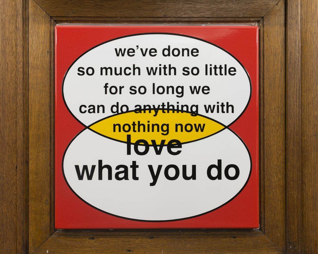
For let’s never be like that at LA MAISON DE RENDEZ-VOUS, Turato presents three new enamel works and a wall painting. Trained as a graphic designer, her visual work echoes a life amongst typeface, packaging, and Adobe Creative Suite, referencing forms and idioms of Frappuccino metropolitan life. Be it a poster series evoking the color-sectioned design of cigarette packaging, huge graffiti tags sprawling across gallery walls, or hacked business Venn diagrams, Turato’s forms work by way of blow-up. In contrast to Joseph Van Neck’s warm wooden wall paneling from 1910, Turato summons contemporary spirits onto the newly installed vitreous enamel surfaces. Turato fills the negative spaces of the wood with messages that are seemingly discrepant to it. Between 1880 and 1950 – thus contemporaneous to this particular architecture – the enamel sign was commonly used for advertising and street signage to harness public speech, movement, and desire. They were signs to be obeyed, be it legally or capitalistically speaking; here, they are domesticated, made into interior, interiorized. This push and pull between the whirlwind of contemporary neoliberal intensity and its place in our households is a trope which she already introduced in it’s a good thing he didn’t click (2019), a hybrid between minimalist sculpture and a Bulthaup kitchen, USB-ports included, evoking the gluttony of today, sitting somewhere between the lavish and the minimal. A place for feeding (i’m no longer a baby), a place for charging (i want power); a businessman’s mouth (as busy as it gets) has to be fed. As a Venn diagram is set to express all possible logical relations between a finite collection of different sets and a tender top managerial tool, her works bring seemingly paradoxical and recalcitrant elements into conjunction. Whereas the diagram should usually serve market analysis and customer satisfaction, here, market effects seem to speak back. Indeed, doing so much with so little and a love what you do share an astringent nothing now. It is only logical in the age of psychopolitics. It is only logical in a world in which enamel is email is e-mail.
Tom Engels
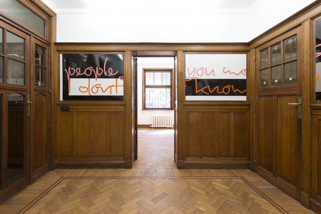
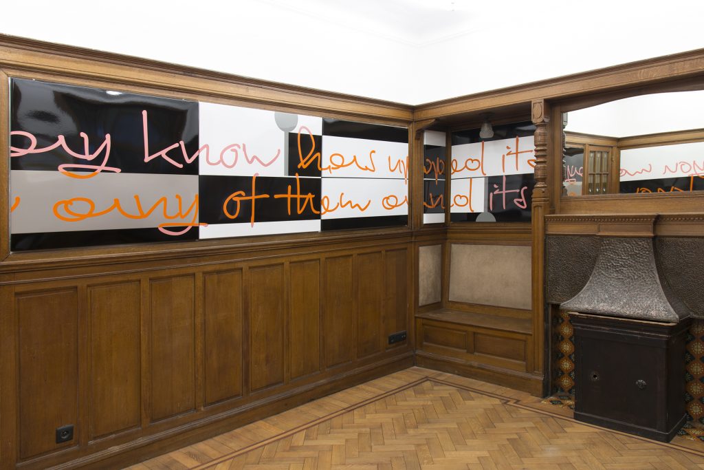
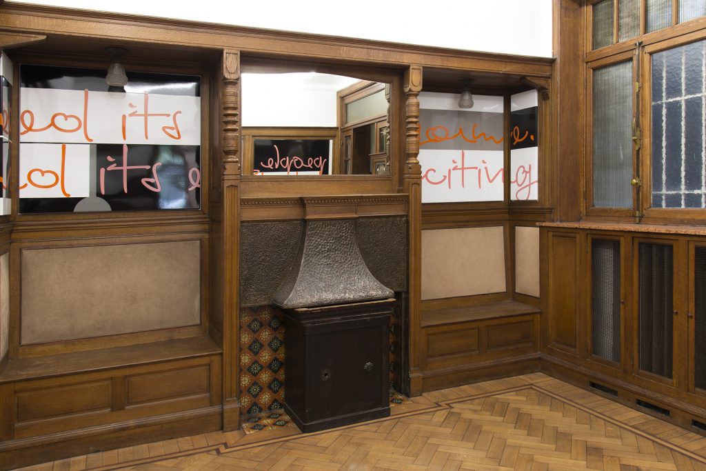
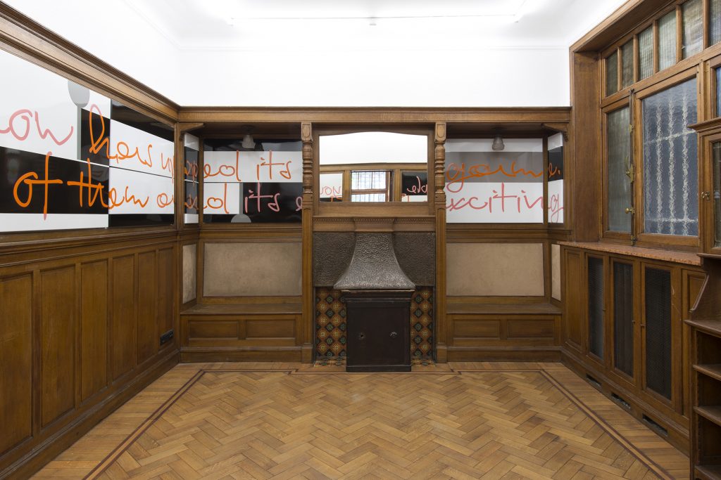
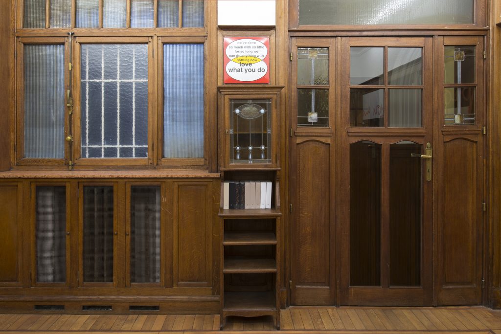
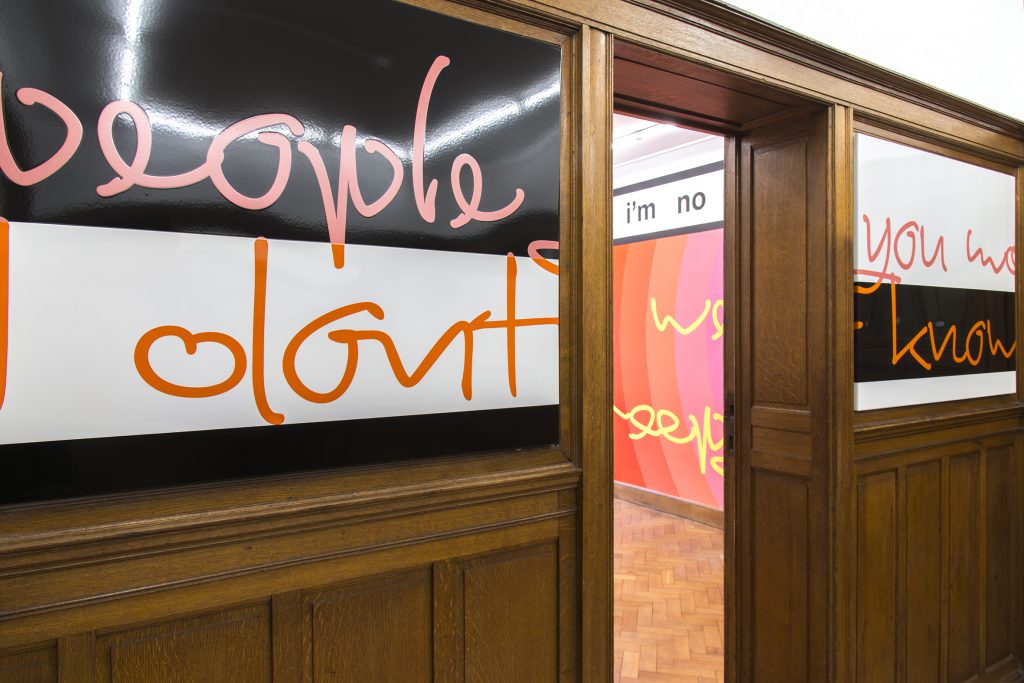
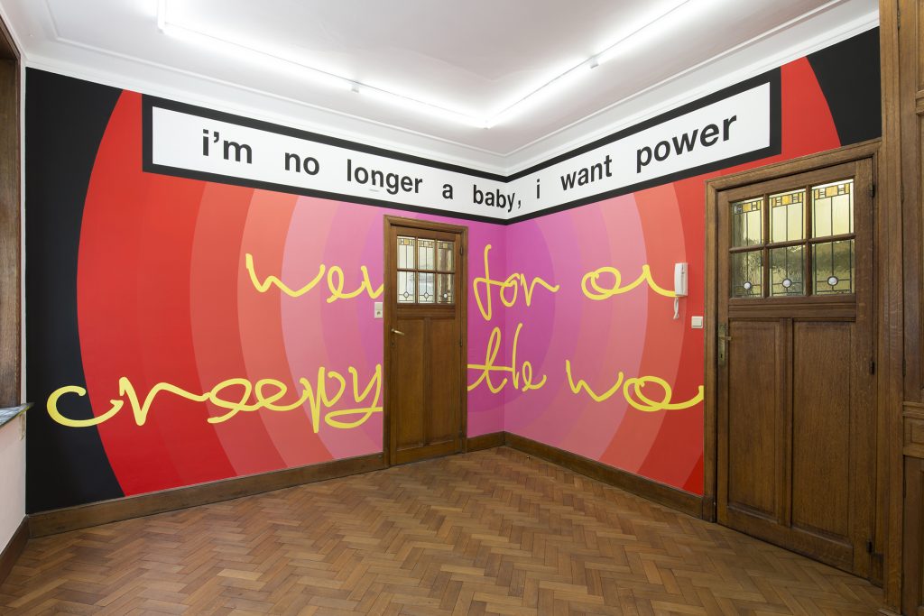
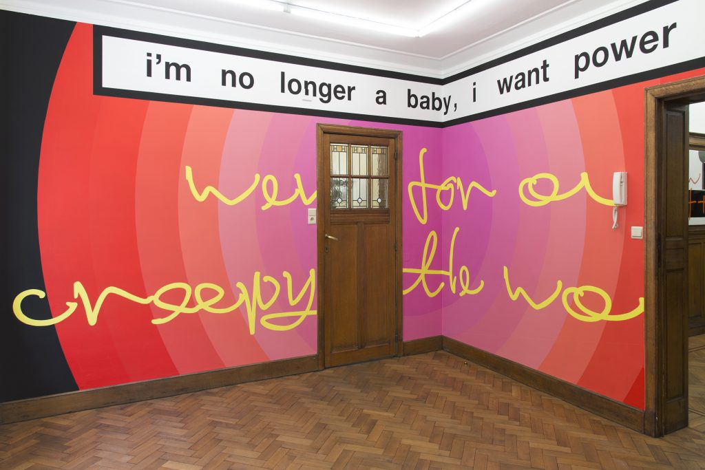
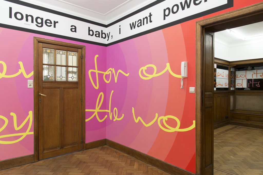
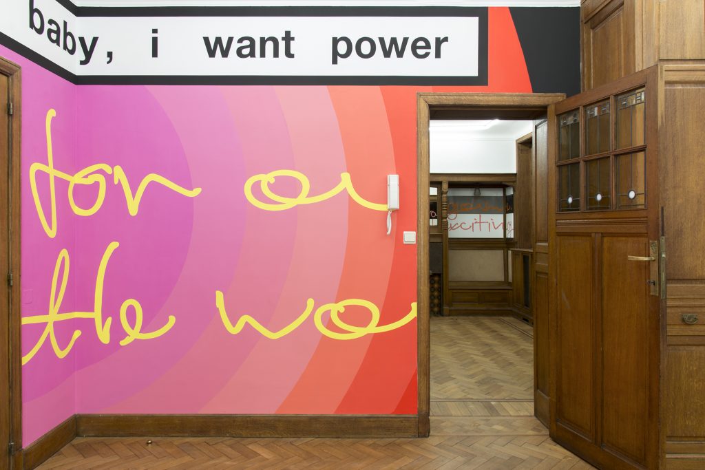
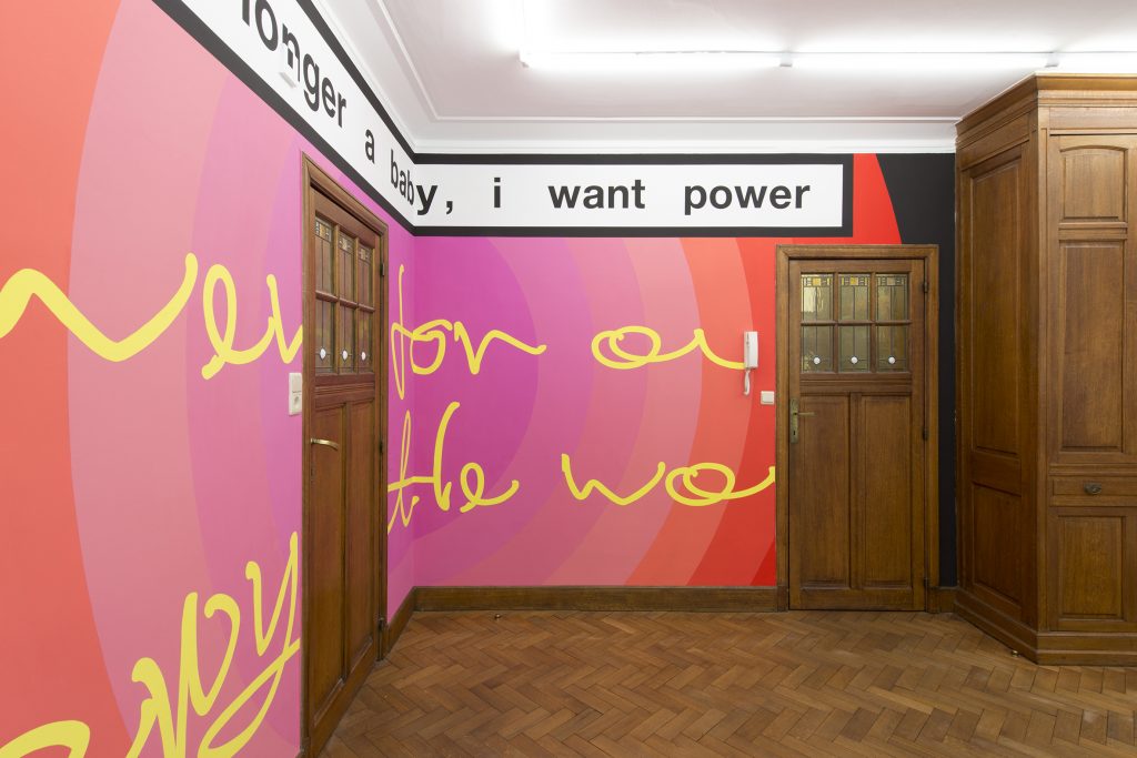
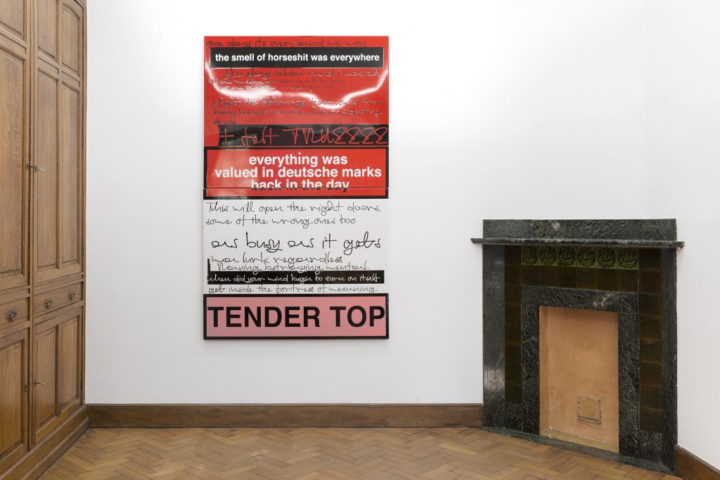

Image credits: Isabelle Arthuis